TradingView has updated its Seasonality charts. Now TradingView users can switch modes and analyze seasonality data not only via traditional charts but also in a clear, structured table.
All one needs to do is select among the options at the top of the page.
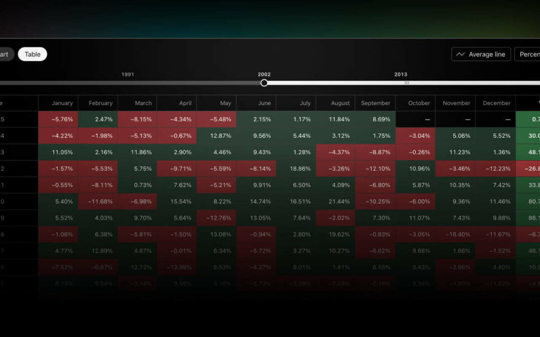
In the table, each row represents a calendar year, while each cell shows the price change for a given month. Cells’ colors make it easy to spot trends at a glance: green highlights positive changes, while red marks negative ones. At the bottom of the table, traders can also find a summary row displaying the distribution of positive and negative months for each year.
The new table view makes it easier to:
- Quickly compare monthly price changes year over year
- Analyze the frequency of positive vs. negative periods
- Identify patterns without switching between charts.
The table is customizable, just like the charts. You can choose the display period (by years), switch between percentage or absolute values, and even add average values — these appear in a separate row at the bottom of the table.


 warrant distribution 6")
