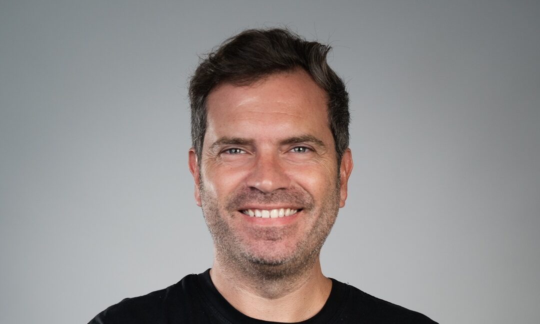
FNG Interview… Since Alfonso Cardalda joined the Retail FX and CFDs industry nearly two years ago becoming Chief Marketing Officer (CMO) at Exness, one of the major projects he has overseen has been the rebranding of the world’s largest online broker. Not an easy task.
We’re pleased to speak today with Alfonso about Exness’ rebranding, and what’s ahead for him and the company.
FNG: Hi Alfonso, and thanks for joining us today. How and why did Exness decide to undergo a major rebranding? Or in other words, why tinker with an already very successful brand?!
Alfonso: Thank you for having me.
So, this is a question I’ve been asked a lot over the past few weeks and there is no denying that any change to a successful and established brand comes with a certain amount of risk. I think we went ahead anyway because it was even more uncomfortable to know that here we were, at the helm of the industry, breaking record after record and becoming the biggest broker in the world, and yet our brand was stuck somewhere in 2008, lagging behind the rest of our evolution and achievements.
With our 15 year anniversary upon us, we decided we wanted to take our brand to the next level. It’s something we’ve been discussing since I joined the company a couple of years ago, and the timing finally felt perfect.
FNG: What are the key elements that will be changing at Exness, beyond the logo?
Alfonso: The only thing that will be changing is a mass improvement in everything we do. Our product superiority and our customer-centric approach have set us apart so far, now our communication and branding is stepping up too. Our plan is to continue doing what we do, with an even stronger focus on our clients. We don’t just want to communicate with them but to listen and connect. A prime example of how we’re already doing this is the Exness Team Pro influencer program we launched in 2023, which amplifies our voice in our key markets and reinvents how we talk to our clients.
FNG: Let’s get down to the details then – what makes the new visual identity so special? You’ve held on to the familiar ‘ex’ from the old logo. What makes it different now?
 Alfonso: You’re quite right, the logo has not changed altogether and it still very much pays homage to the original logo which saw us through 15 years of evolution. The reason we did this was to maintain the connection between past and future achievements and yet step into new shoes at the same time. Our new logo is firstly much more modern, simple and sleek, and it is defined by what we call the exo emblem.
The exo is symbolic of the two pillars which have defied our brand story and success; the head and the heart. In other words, the mathematical aspect of Exness found in our product and tech innovations, fused with the human side of Exness, reflected in our client-centric and people-centric approach, both internally and externally. Our font and color palette have also been upgraded to be more modern, bright and bold.
FNG: Are you at all concerned that your clients and partners may not like this revamped visual identity?
Alfonso: Not at all. The decision to rebrand of course was not made blindly, it involved long-term research not only among employees but also among clients and partners, who shared their feedback and expressed support in the direction we were taking. The results have also already spoken for themselves, with a spike recorded in traffic and in product interaction.
FNG: What else can we expect to hear from Exness in the coming months?
Alfonso: Our plan is to continue improving our product and core offering for our clients and partners. And this will always be the plan – for the next 5, 10, 15 years. We never aim to remain in our comfort zone, we always want to go further and further. At Exness, we go by the mantra “Good enough is not enough” and I honestly believe it is what got us so far.


