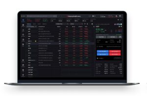
TradingView has made seasonality charts more powerful – traders can now choose to display an average line over a selected time period.
This new feature provides a clearer, more intuitive view of seasonal patterns’ overall direction and trend. By visualizing the average movement across several years, you can better identify consistent behaviors and make more informed decisions.
Enabling the feature is simple. Just click the Average line button above the seasonality chart. A dashed average line will appear, calculated using the data from your selected year range. This makes it easier to interpret complex seasonal trends at a glance.


